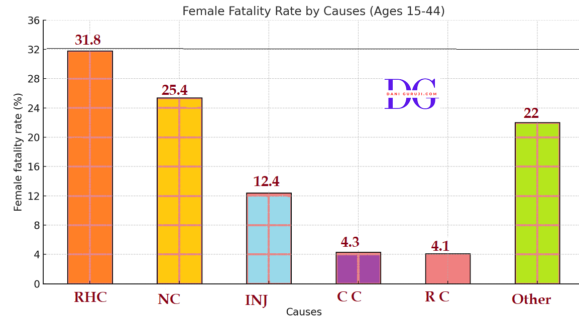
A survey conducted by an organisation for the cause of illness and death among the women between the ages 15 - 44 (in years) worldwide, found the following figures (in %):
S.No.
Causes
Female
fatality
rate
(%)1
Reproductive health condition
31.8
2
Neuropsychiatric conditions
25.4
3
Injuries
12.4
4
Cardiovascular conditions
4.3
5
Respiratory conditions
4.1
6
Other causes
22.0
(i) Represent the information given above graphically.
(ii) Which condition is the major cause of women’s ill health and death worldwide?
(iii) Try to find out, with the help of your teacher,
any two factors which play a major role in the cause in (ii) above being the major cause.
Solution :
(i) The data showing the causes of illness and death among women aged 15 to 44 years worldwide is represented below using a Bar Graph.
The causes are plotted on the x-axis, and the female fatality rate (in % ) is plotted on the y-axis, and selecting an acceptable scale (1 unit = 4% for the y-axis).
(ii) From graph,We observe that,
Reproductive health issues are the primary cause of women's illness and mortality worldwide.
(iii) Two factors that play a major role in making reproductive health conditions the leading cause are:
1. Lack of proper maternal healthcare. In many parts of the world, women do not have access to proper medical care during pregnancy and childbirth.
2. Malnutrition and lack of awareness. Poor nutrition, especially among young mothers, weakens the body and leads to complications.
Lack of awareness about family planning, safe delivery practices, and reproductive health also increases risks.
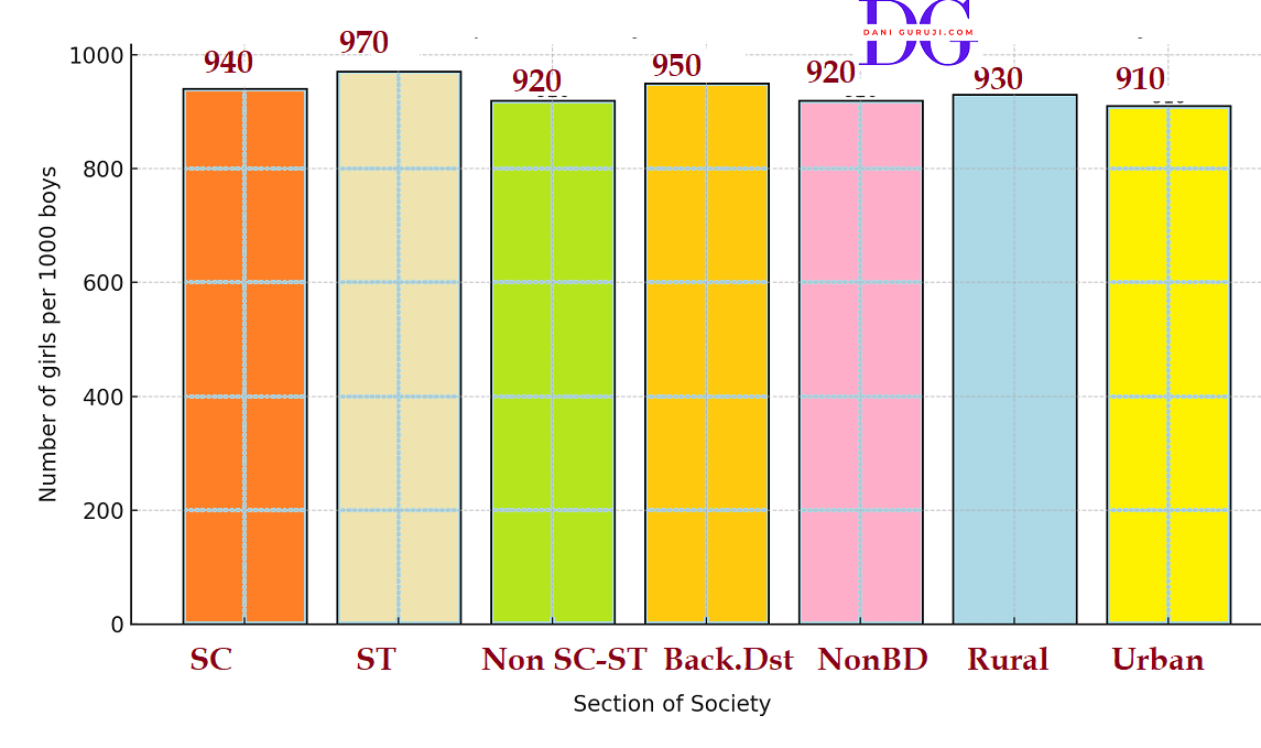
The following data on the number of girls (to the nearest ten) per thousand boys in different sections of Indian society is given below.
Section.
Number of
girls per
thousand
boysScheduled Caste (SC)
940
Scheduled Tribe (ST)
970
Non SC/ST
920
Backward districts
950
Non-backward districts
920
Rural
930
Urban
910
(i) Represent the information above by a bar graph.
(ii) In the classroom discuss what conclusions can be arrived at from the graph.
Solution :
(i) The information on the number of girls per thousand boys in different sections of Indian society is represented below by a Bar Graph.
Plot number of girls per thousand boys at y-axis by taking 1 unit = 200 girls,and representing each section (variable) on the x-axis .
(ii) From graph,We observe that,
Scheduled Tribe (ST) section has the highest ratio of girls per thousand boys, at 970. This indicates a more favorable gender ratio compared to other groups.
Backward districts (950) have a noticeably higher gender ratio than Non-backward districts (920).
This difference may suggest a correlation between economic development/modernization (represented by "Non-backward districts") and a decline in the gender ratio, similar to the Rural vs. Urban comparison.
The Scheduled Caste (SC) section (940) and Scheduled Tribe (ST) section (970) both show a higher gender ratio than the Non SC/ST section (920).
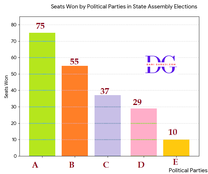
Given below are the seats won by different political parties in the polling outcome of a state assembly elections:
Political
PartySeats
WonA
75
B
55
C
37
D
29
E
10
F
37
(i) Draw a bar graph to represent the polling results.
(ii) Which political party won the maximum number of seats?
Solution :
(i) The polling results for the state assembly elections are represented in the bar graph below. The parties are sorted by the number of seats won, from highest to lowest, for clear visual comparison.
(ii) The political party that won the maximum number of seats is Party A, with 75 seats.
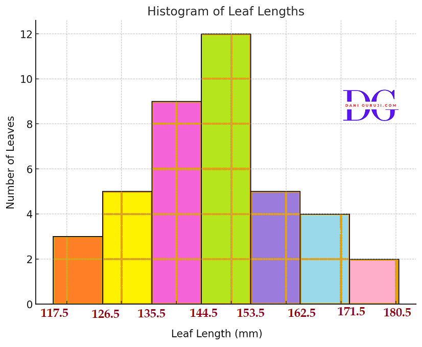
The length of 40 leaves of a plant are measured correct to one millimetre, and the obtained data is represented in the following table :
Length
(in mm)Number
of leaves118 - 126
3
127 - 135
5
136 - 144
9
145 - 153
12
154 - 162
5
163 - 171
4
172 - 180
2
(i) Draw a histogram to represent the given data. [Hint: First make the class intervals continuous]
(ii) Is there any other suitable graphical representation for the same data?
(iii) Is it correct to conclude that the maximum number of leaves are 153 mm long? Why?
Solution :
(i) The given data has discontinuous class intervals (e.g., 118−126 and 127−135).
To draw a histogram for continuous data, the classes must be made continuous by adjusting the boundaries.
The continuous class intervals (class boundaries) are calculated by subtracting 0.5 from the lower limit and adding 0.5 to the upper limit of each class.
Length
(in mm)Number
of leaves117.5 – 126.5
3
126.5 – 135.5
5
135.5 – 144.5
9
144.5 – 153.5
12
153.5 – 162.5
5
162.5 – 171.5
4
171.5 – 180.5
2
Here’s the histogram showing the distribution of leaf lengths.
(ii) Yes , besides a histogram, we could also use a frequency polygon or an ogive (cumulative frequency curve) to represent the same data.
(iii) No , We cannot conclude that the maximum number of leaves are exactly 153 mm long.
The data is grouped into class intervals (e.g., 145–153). The frequency (12) tells us the number of leaves within that whole interval, not at one exact length.
So, we can only conclude that the 145–153 mm class interval has the maximum number of leaves.
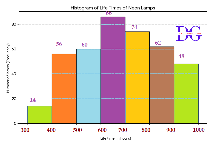
The following table gives the life times of 400 neon lamps:
Life
time
(in hours)Number
of
lamps300 - 400
14
400 - 500
56
500 - 600
60
600 - 700
86
700 - 800
74
800 - 900
62
900 - 1000
48
(i) Represent the given information with the help of a histogram.
(ii) How many lamps have a life time of more than 700 hours?
Solution :
(i) The life times of the 400 neon lamps are represented by the histogram below . The height of each bar corresponds to the number of lamps (frequency) in that specific, x-axis → Life time intervals (class).
(ii) To find the number of lamps with a life time of more than 700 hours, we need to sum the frequencies of the classes that start at or above 700 hours.
Total lamps=74 + 62 + 48 = 184
There are 184 lamps that have a life time of more than 700 hours.
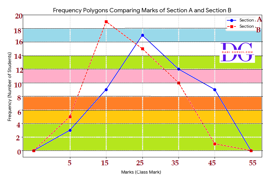
The following table gives the distribution of students of two sections according to the marks obtained by them:
Section A
Marks
Frequency
0 - 10
3
10 - 20
9
20 - 30
17
30 - 40
12
40 - 50
9
Section B
Marks
Frequency
0 - 10
5
10 - 20
19
20 - 30
15
30 - 40
10
40 - 50
1
Represent the marks of the students of both the sections on the same graph by two frequency polygons. From the two polygons compare the performance of the two sections.
Solution :
To construct the frequency polygons, the class mark (mid-point)
for each marks interval was used on the x-axis, and the corresponding frequency (number of students) was used on the y-axis.
The points were connected by line segments, and the polygon was closed by assuming a preceding and a succeeding class with a frequency of 0.
Marks
Class
MarkFreq.
AFreq.
B-10 - 0
-5
0
0
0 - 10
5
3
5
10 - 20
15
9
19
20 - 30
25
17
15
30 - 40
35
12
10
40 - 50
45
9
1
50 - 60
55
0
0
The performance of Section A is generally better than Section B.
This is because the majority of students in Section A have scored marks in the higher ranges (peaking at 20−30 marks),
while the majority of students in Section B are concentrated in the lower mark range (peaking at 10−20 marks).
The runs scored by two teams A and B on the first 60 balls in a cricket match are given below:
Number
of
ballTeam A
Team B
1 - 6
2
5
7 - 12
1
6
13 - 18
8
2
19 - 24
9
10
25 - 30
4
5
31 - 36
5
6
37 - 42
6
3
43 - 48
10
4
49 - 54
6
8
55 - 60
2
10
Represent the data of both the teams on the same graph by frequency polygons. [Hint : First make the class intervals continuous.]
Solution :
(i) The given data has discontinuous class intervals (e.g., 1−6 and 7−12).
To draw a histogram for continuous data, the classes must be made continuous by adjusting the boundaries.
The continuous class intervals (class boundaries) are calculated by subtracting 0.5 from the lower limit and adding 0.5 to the upper limit of each class.
The class marks are plotted on the x-axis, and the runs (frequency) are plotted on the y-axis.
Number
of
ballClass
markTeam
ATeam
B0.5−6.5
3.5
2
5
6.5−12.5
9.5
1
6
12.5−18.5
15.5
8
2
18.5−24.5
21.5
9
10
24.5−30.5
27.5
4
5
30.5−36.5
33.5
5
6
36.5−42.5
39.5
6
3
42.5−48.5
45.5
10
4
48.5−54.5
51.5
6
8
54.5−60.5
57.5
2
10
The frequency polygons for the runs scored by Teams A and B across the 60 balls. The table of continuous intervals with midpoints is also shown for clarity.
Team A had stronger performance in the middle overs, while Team B dominated the beginning and end phases.
Team A is shown by the solid green line and Team B is shown by the dashed purple line .
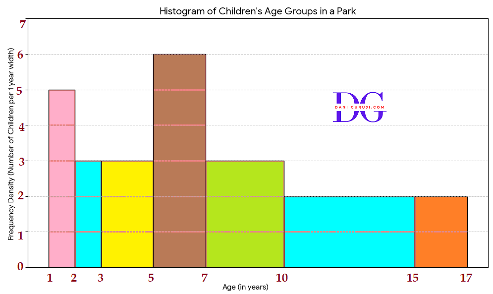
A random survey of the number of children of various age groups playing in a park was found as follows:
Age
(in years)Number
of
children1 - 2
5
2 - 3
3
3 - 5
6
5 - 7
12
7 - 10
9
10 - 15
10
15 - 17
4
Draw a histogram to represent the data above.
Solution :
The data provided has unequal class widths, so to draw an accurate histogram, the height of each bar must represent the Frequency Density, which is calculated as:
Frequency Density = Frequency / Class Width
Age
(in yrs)Number
of
childrenClass
WidthFrequency
Density1 - 2
5
2−1=1
5/1=5.0
2 - 3
3
3−2=1
3/1=3.0
3 - 5
6
5−3=2
6/2=3.0
5 - 7
12
7−5=2
12/2=6.0
7 - 10
9
10−7=3
9/3=3.0
10 - 15
10
15−10=5
10/5=2.0
15 - 17
4
17−15=2
4/2=2.0
The histogram, with the height of each bar corresponding to the calculated Frequency Density, is shown above.
The area of each bar in this histogram is proportional to the frequency of children in that age group.
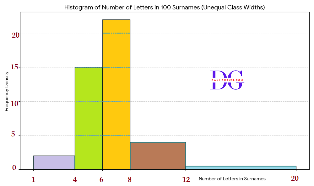
100 surnames were randomly picked up from a local telephone directory and a frequency distribution of the number of letters in the English alphabet in the surnames was found as follows:
Number
of
lettersNumber
of
surnames1 - 4
6
4 - 6
30
6 - 8
44
8 - 12
16
12 - 20
4
(i) Draw a histogram to depict the given information.
(ii) Write the class interval in which the maximum number of surnames lie.
Solution :
The data provided has unequal class widths, so to draw an accurate histogram, the height of each bar must represent the Frequency Density, which is calculated as:
Frequency Density = Frequency / Class Width
Age
(in yrs)Number
of
childrenClass
WidthFrequency
Density1−4
6
2
2
4−6
30
2
15
6−8
44
2
22.0
8−12
16
4
4.0
12−20
4
8
0.5
(ii) The maximum number of surnames is found by looking for the highest frequency in the original data:
This maximum frequency of 44 corresponds to the class interval 6−8.
Therefore, the class interval in which the maximum number of surnames lie is 6−8.
Syllabus for class 10
Advanced courses and exam preparation.
Previous Year Paper
Advanced courses and exam preparation.
Mock Test
Explore programming, data science, and AI.